Monday, January 31, 2011

OPI Black Shatter & China Glaze Shocking Pink

Good morning, Dear Reader!

Last night I was changing my polish for today, and I decided I'd fulfill my promise and wear Black Shatter one more time so I could forever be done with it.  I said I'd try it over a neon pink, but wearing the last Black Shatter manicure for a couple of days convinced me it wasn't for me.  I decided to do what I could to make this one more tolerable and got on with it.

I applied three coats of China Glaze Shocking Pink, which I've shown you before.  It's a retina-searing, distractingly neon pink creme, and is kind of a PITA to apply in the same way that the China Glaze OMG's and Nfu Oh holos are, but also like those, the color is completely worth the effort.  I topped that off with quick dry top coat and while it dried, considered what I didn't care for in Black Shatter and how to work around those things.

The first thing is that I don't like how the tinier cracks look, and the second is it bugs me when my nails aren't smooth.  When I applied Black Shatter to Shocking Pink, I used a thicker coat of it so it would make bigger cracks, and I finished it like it was a glitter and used three coats of top coat.  As for smoothness, there are still some small bumps from the crackle but they're tiny and now it's very glassy, so that worked out well, and here you can see that the thicker coat of Black Shatter worked too.

OPI Black Shatter & China Glaze Shocking Pink
OPI Black Shatter over China Glaze Shocking Pink
What was truly shocking here is that I like it.  Previously, I think the fact that it's black was a big problem as well - I never would have combined black with a pale pink glitter, but I would (and have) with Shocking Pink, so this one just works for me.  I was surprised at how much I really like it.

In fact, as the top coat finished curing, I was admiring this mani when into my head popped the thought, "This looks like something C.C. DeVille would wear."  Consulting Google for a mere moment confirmed that this was indeed true.  Note the hot pink guitar strap and Black Shatter jacket.

Black Shatter & Shocking Pink?
At first this just struck me as really funny, and later I realized that there's some dark recess of my brain that's always at the ready and burning up precious mental energy, just to offer me disturbingly accurate and brisk recall of the stage attire of 80's hair bands.  But, you know what they say: every rose has its thorn.

That's my manicure for today, and the one that's swayed my opinion on crackle polishes.  Until next time, Dear Reader, love and nail polish to you!  

Sunday, January 30, 2011

Minnie Mouse in the House


Plate: Bundle Monster - BM19
Base Colour: NYC Glossies (I've lost the bottle so I can't tell you which one)
Stamp Colour: Stargazer - White
Top Coat of NYC

Free Hello Kitty Fauxnad Plate

There is some weirdness with this vendor's site you should be aware of before entering your info.

The status on whether this code is active this changes from day to day. The top comment for this post is the most recent, and that's the latest word I have on it. Please read the top comment to see where this currently stands.

Good morning, Dear Reader!

A few weeks ago, I received an email asking me about an overseas web site that was offering a completely free Hello Kitty nail art stamping plate (specifically, if it was legitimate). I'd never heard of it, so I figured there was only one way to find out and I placed the order, for which I did not have to enter any payment information. When someone tells me they'll give me something for nothing, I tend to hope for the best without any real expectations, and I promptly forgot all about it until I received a little envelope from Singapore yesterday that had the plate inside.

Since it is legitimate, I thought you'd want to know about it. The site is called Born Pretty, and the item is called Hello Kitty Nail Art Stamping Plate. Here's Born Pretty's picture of the plate, which is numbered M71.

Free Hello Kitty Fauxnad Plate
Free Hello Kitty Nail Art Stamping Plate from Born Pretty
To get it, add the plate, which displays a price of $2.99, to your cart and go to check out. For shipping method, choose "Airmail (Unregistered)" for free shipping, and enter coupon code BP299 to deduct the $2.99 price of the Hello Kitty plate, and for your payment option choose "I have paid before/Free items," which doesn't prompt for additional billing info. Submit order, and that's it.

Mine took 3 weeks to arrive, which is about the time I'd expect. I checked the site now for my order history to get the details above, and found that my order status is Pending. That's not a huge problem, but it indicates to me that their system is not 100% automated since the order was shipped and delivered. That can cause some hassles when something isn't manually updated correctly on their side, so I wouldn't be astounded if an order required a few emails, but their CS was good - I recall getting an email clarifying some detail right after I placed the order. I mention that just because I'd want to know about it before spending money on a future order.

I thought this was a nice thing because I'm always a bit reluctant ordering from a smaller place overseas, and this lets potential customers place a test order for free and see how the company does. They had a few other offers for a free item going, but they all required additional action, such as tweeting links. I didn't want to announce this until I'd gotten a test order just in case it went south, so I only went for the one.

Born Pretty has a lot of fauxnad plates and cheap nail art supplies (and oddly, colored contacts, but I think I'd hold off on ordering from them and go to an optometrist), and I'd place an order for paid items from them now.

For the record, I placed my order strictly as a test to see how they did so I could tell you about it, and Born Pretty was given no indication that anything about my order would be published anywhere (or that a platform for me to do so exists) , so I believe the service I received is what can generally be expected of them. Fortunately, you can place your own test order and verify that for free. If you place an order and have a noteworthy experience either way, please leave a comment - additional accounts experience with the company would be useful to anybody interested in ordering.

One addition - I just noticed the banner at the top of their home page announcing time off for Chinese New Year, so they probably won't reply to emails for a bit, and that's something to be aware of.

That's all I had to pass on to you this morning, Dear Reader. Until next time, love and nail polish to you!

Saturday, January 29, 2011

Leopard Got The Blues

How do you like my new banner? I'm not too sure about it so I might make another one or go back to the old one soon.


Konad Plate: M57
Base Colour: No7 - Betty Blues
Konad Colour: China Glaze - Adore
Barry M Blue Glitter for the dots
Top Coat of NYC

OPI The One That Got Away

Good morning, Dear Reader!

This morning I was happy to see that the sun had peeked out a bit (not blazing clear-sky sun, but much better than it's been), so I looked for a polish that I thought needed decent sunlight for a good picture, and OPI The One That Got Away was first on the list.

The One That Got Away seems to be the least-loved of OPI's Katy Perry Collection, but I think it's fantastic. It's a deep red-berry shade that's full of the sparkly pigment we saw so much of in the last half of 2010 (OPI Holiday, Nubar Venetian, Zoya Fire & Ice).  The polish is thin but still easy to control, and after two coats the coverage was adequate but didn't have as much sparkle as the polish in bottle, so I added a third and it now it does.  This is The One That Got Away completely dry in moderate sunlight.

OPI The One That Got Away
OPI The One That Got Away Nail Polish, Three Coats
I know it's not as out of the ordinary as Black Shatter or Teenage Dream, but it's an infinitely more wearable shade with a great finish, and I think there's something to be said for that.  Since I didn't see as much hype around The One That Got Away, right after I placed the order including it I was kind of kicking myself, but I was quite pleasantly surprised at just how pretty it is when it arrived.  It's probably my favorite of the OPI Katy Perry Collection.

I'm off to start a busy day that will be lightened by peeking at a pretty sparkly nail polish in the sun, so until next time, Dear Reader, love and nail polish to you! 

Friday, January 28, 2011

Barry M Mint Green

I had my last exam today. I'm so so so happy to have them over, even though I think I failed 3 out of the 4.
After the exam some friends and I went out for a pub lunch and just chatted for nearly 2 hours which was so much fun as I've been stuck inside for nearly 3 weeks. I was planning on going out with my friends tonight but decided to stay in eating, sleeping and watching movies since I haven't really had a chance just to chill for the so long, but I'm looking forward to going out tomorrow - it should be a crazy night!


Konad Plate: M35
Base Colour: Barry M - Mint Green
Konad Colour: BYS - Fools Paradise
No7 Betty Blues for the dots done with a dotting tool
Top Coat of NYC

8 More Beiber Polishes


I'll admit it, I'm so NOT a Justin Beiber fan, and I was mightily embarrassed to purchase any of the collection, but they ARE pretty colors (if you can get past that HAIR...*cringe*)

Anyway, they've released 8 new colors in the Beiber line...


NICOLE BY OPI ONE LESS LONELY GIRL
8 New Lacquer Additions

WHAT: Nicole by OPI is unveiling eight more shades in the One Less Lonely Girl collection! With colors created by Nicole by OPI Executive VP & Artistic Director Suzi Weiss-Fischmann, these eight new Nail Lacquers are inspired by Justin Bieber’s songs and his devoted fans.

The One Less Lonely Girl Collection was conceived to raise awareness for Pencils of Promise, an organization that builds sustainable schools for underserved children in the developing world. In addition to educating consumers about this non-profit, Nicole by OPI has committed to building two such schools.

LACQUERS:
• My Lifesaver
Go overboard in color with this soft mint green!

• “Baby” Blue
A sweet light blue that totally loves you.

• One Time Lime
A vibrant lime that’s worth your time.

• I’m A Belieber
This popular purple has quite the following.

• Red-y to Runaway Love?
Run away with this riveting red.

• Make U Smile
Mood-boosting bunches of silvery glitter!

• I’ve Got Bieber Fever
This gorgeous dark plum is super contagious!

• Not A Gold Bigger
A genuinely glamorous gold that you’ll never take for granted.

RETAIL PRICE: $7.99 each
AVAILABILITY: January at Walmart and February at select Target, Sears, ULTA, and other retail locations, for $7.99 each.

ABOUT PENCILS
OF PROMISE:


Pencils of Promise, a registered 501 (c)(3) nonprofit, builds sustainable schools, partnerships and solutions to enable basic education for underserved children in the developing world. More information about Pencils of Promise is available at www.pencilsofpromise.org.

OPI Texas Collection (PREVIEW)


From the state where bigger is better, and cowboys are king... OPI brings a collection of colors for Spring/Summer 2011!

OPI comes “home” to the USA with timeless style in the Texas Collection for Spring/Summer 2011. These vivid shades are as iconic as images of an American summer – adding a fresh, effortlessly chic look for nails and toes.
“Texas provided the inspiration for this season, with bright colors and classic neutrals that draw from the American spirit,” says Suzi Weiss-Fischmann, OPI Executive VP & Artistic Director. “Taking cues from the state’s naturally beautiful backdrop, the Texas Collection features warm tones from honey and tangerine to dazzling hues of violet and sky blue.”
This season, American classics come to life with sunny peach (Big Hair…Big Nails) and vivid honeysuckle (Too Hot Pink to Hold ‘Em). Lush berry (Houston We Have a Purple) and grassy green (Don’t Mess with OPI) add a splash of the USA’s most vibrant colors to the season’s must-have neutrals (San Tan-tonio).
“The Texas Collection complements trends from the runway, where white made an appearance as the new black,” explains Suzi. “Wearing these colors on fingers and toes will accessorize the season’s must-have pieces – from brightly colored botanical prints and filmy scarves to relaxed trousers and jackets and fuller, longer skirts – all done in shades of white, ivory, cream and taupe.”

Texas Collection accompanies spring and summer fashion favorites with the following shades:


San Tan-tonio
A “honey” of a ten-gallon tan!

Suzi Loves Cowboys
But she loves this campfire chocolate shade s’more!

It's Totally Fort Worth It
A shimmery lavender grey that’s so worthy of you.

Don't Mess with OPI
A lean, mean, kick-grass forest green.

Austin-tatious Turquoise
Cowgirls love this bodacious blue-green.

I Vant to Be A-Lone Star
You won’t want to share this starry Texas-sky blue.

Y'all Come Back Ya Hear?
This Texas tangerine will be waitin’ for ya!

Big Hair...Big Nails
A rosy pageant peach.

Guy Meets Gal-veston
An “engaging” coastal coral.

Too Hot Pink to Hold 'Em
A red-hot pink-red that deals a winning hand.

Do You Think I'm Tex-y?
A “berry” sexy bloom of Dallas dahlia.

Houston We Have a Purple
A galactic red-violet that’s ready to “rocket roll”!

OPI’s Texas Collection Nail Lacquer shades contain no DBP, Toluene, or Formaldehyde, and each includes OPI’s exclusive ProWide™ Brush for the ultimate in application.


There is also a new finish that OPI is introducing, called 'Sorbet':

From the company that brought revolutionary nail textures like matte, suede, and Black Shatter to women around the world, OPI announces a new special finish – semi-transparent sorbet shades. Featured first in the Texas Collection by OPI for Spring/Summer 2011, these lacquers give fingers and toes a lightly glossed appearance.

“These sorbet-style formulas for nails will be in full swing by 2012, but women can get a jump start on this trend with colors in the Texas Collection,” says Suzi Weiss-Fischmann, OPI Executive VP & Artistic Director. “Unlike thicker creams or light sheers, these twelve shades are slightly translucent – similar to the look of icy, water-based sorbet!”

From sea blue and berry pink to tangerine and bright peach, the Texas Collection features classic American colors. Designed to complement trends from the runway, these candy-coated lacquers accessorize the season’s must-have neutral pieces.

“To achieve the desired effect, an initial coat of Nail Lacquer should be applied to all ten fingers first – without doubling up coverage,” explains Suzi. “Be sure to start from the pinky finger on one hand and paint through to the pinky on the other hand; then, after the first coat has dried, apply a second coat.”

Texas Collection by OPI will be available February 2011, at Professional Salons, including Beauty Brands, Beauty First, Chatters, Dillard’s, JCPenney, Pure Beauty, Regis, Trade Secret, and Ulta, for $8.50 ($10.95 CAN) suggested retail for each Nail Lacquer.

For more information, please call 800-341-9999 or visit www.opi.com.


Zoya Gemma

Hello, Dear Reader!

This morning I put on Zoya Gemma, which was a nice change from the OPI Teenage Dream and Black shatter I'd had on for a couple of days.  I'd mentioned in the first post about Black Shatter that  the old crackle polishes were agonizing for me to remove, but that wasn't the case with Black Shatter - it came right off.  Teenage Dream, on the other hand, was a project to remove.  Anyhow, Gemma's a good one after that!

Zoya Gemma is one of the Intimates Collection for Spring 2011, and it's another that's a good rendition of a pretty standard color with an exceptional finish.  The base color is an olive drab, of which there have been many in the past couple of years, but Gemma's twist is that is has a strong blue flash that's distinctly visible even in indoor lighting.  Although thinner than Marley, it only took two coats to be even and opaque and had an average dry time.

I took about a million pictures of Gemma in different lighting conditions, but I had the poor judgment to start outside in natural light (of which there is terribly little today) so my hands got really cold and pretty red.  The drab greens tend to accentuate redness, so please forgive my poor cold lobster hand.  The pictures that ended up most accurately showing the polish were under artificial light (so freezing my hand until it was red was entirely unnecessary), and this is Zoya Gemma completely dry.

Zoya Gemma
Zoya Gemma Nail Polish, Two Coats
That blue shimmer really does show this clearly in indoor lighting, it's super cool.  For me, Zoya's two for two on the Intimates - I really like the subtlety of both that I've used so far.  They're like new and improved versions of the base colors.

That's what I have for you this morning, Dear Reader.  Until next time, love and nail polish to you!  

*This polish was sent to me by the manufacturer for review.

Thursday, January 27, 2011

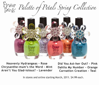
Finger Paints Palette of Petals Spring Collection (PREVIEW)


Holy cuteness. I'm lovin' this new collection for Spring from Finger Paints- and those flower rings?! Adorable. Can't wait to see these in person- I love fun colors!! I think Dahlia My Number and Chysanthe-mum's the Word are my favorites just from the pictures!

Aren't You Glad-iolous?

Carnation Creation

Chrysanthe-mum's the Word!

Dahlia My Number

Did You Ast-her Out?

Heavenly Hydrangeas


FingerPaints Palette of Petals Preview

Good afternoon, Dear Reader!

I just received some promo pictures from Sally Beauty Supply for their Spring 2011 collection, Palette of Petals.

Here's what I have:

FingerPaints Palette of Petals Collection
FingerPaints Palette of Petals Collection for Spring 2011

The others are little color dots, and I'm not entirely sure which is which (I discovered upon renaming them so I can find them...).  In any case, they look really cheery to me, so I'm excited to see them.

That's all I had to tell you!  I get all excited about seasonal FingerPaints, so I wanted to pass it on.  Until tomorrow, Dear Reader, love and nail polish to you! 

Graphic Neon


This week has been crazy X 10. I feel like all I do is work and sleep. (I worked a 17-hr day on tuesday- that is redonk!) I'm trying to get swatches and reviews of new products done, as well as attend to my actual life necessities, like bathing, and putting food in my head. I've got a few things in the next week or so I hope you'll get a kick out of, or at least take something from. I feel bad about all the simple, non-crazy detailed nail designs lately...to be honest, I just don't have the energy, but I'm TRYING, I promise!! :)


I used Nubar Stronghold as a base, with Zoya Dove for the lighter grey and MAC Vestral White with Color Club VOlt of Light over it for the neon yellow dots (man was that color hard to capture correctly on camera, I can never show the actual brightness of it as it looks in real life!) TOpped it all off with 2 coats of Seche Vite top coat.

Don't forget- you still have until tomorrow (Friday) at 11:59 p.m. Pacific time to enter the contest!! :)

Zoya Marley

Good morning, Dear Reader!

This week Zoya sent me their Intimates Collection for Spring 2011 to review, but I was scurrying about with Black Shatter to give you a look while it was available and haven't told you about them yet.

As you can see from the title, I only have Zoya Marley to show you today.  The reason for that is when I opened the Intimates and looked at them in the light, I was really struck by how cool the finishes on many of them are (two are cremes), and since they're already for sale on Zoya's site, I'm not hurrying to give you a peek before they're online.  The thing is, some shimmers look different when wet and completely dried (like SpaRitual Steel Magnolia, a frostfest wet and strong shimmer dry), and the Intimates look fabulous enough to warrant dry mani pics.  For pre-release swatches, that's not reasonable since it would take several hours, but I have the luxury of doing them one at a time.

My first choice was Marley because it's a very pale, muted lavender with the most subtle pearly finish.  It's a very delicate color with a delicate finish, and I think it works really well.  The application of it was excellent and I only needed two coats, while for a shade this pale three would not be unusual.  I took the picture of this one a couple of days ago, in natural light with the sun fading in and out.  Ideally, I would have had strong sunlight to show the shimmer, but since I wanted to show these to you before May, I made due with what was available.

Zoya Marley
Zoya Marley Nail Polish, Two Coats
The shimmer shows best where the light is reflected.  Isn't that cool?  It's barely there, yet easily visible.  The shimmer reminds me  of Chanel Peche Nacree.  My hand is a little pink here because it was super cold out, and this was the 10th picture I took.   I didn't realize it was quite so cold, so I was out there in a t-shirt.  At least a whole bunch of neighbors drove past and saw me wandering around outside without a coat on taking pictures of my hand.

That's Zoya Marley, and it's far prettier than I had anticipated.  Although the color isn't unusual (it's here in front of me next to a SpaRitual creme almost the same shade), that finish really is something special, and for me it's perfectly paired with the color.  I'm a big fan of this one.

I don't have much else to tell you this morning, so until next time, Dear Reader, love and nail polish to you! 

Wednesday, January 26, 2011

Simple Ruffian

This one's a bit messy. I'm terrible at doing tips or ruffian in any capacity let alone attempting to get the tiny little stripes matte so it went all lumpy and bumpy but I quite like it, I'm going to attempt at again in the future. After all, practice makes perfect.


The base colour is Barry M Cyan Blue with one coat of BYS Tinkerbell to get the shimmer, then a top coat of NYC.
The dark blue is No7 Betty Blues and I used E.L.F Matte finisher to matte out the ruffian strips.

OPI Teenage Dream & OPI Black Shatter

Good afternoon, Dear Reader!

I gave OPI Black Shatter another shot last night, so we can take another look at it.  Today I put it over one of the Katy Perry OPI glitters, Teenage Dream.  Teenage Dream is a bunch of tiny regular and round holo glitter in a somewhat sheer base.  I usually evaluate the opacity of a polish by holding it sideways above eye level and rolling it - by how well I can see the mixing balls through the polish, I can tell how opaque it'll be.  This one seems pretty sheer.

I figured I'd use a complimentary creme under it, and I did one coat of SpaRitual I Am the Light.  That's not truly a one-coater - I had to apply carefully to get even coverage.  When I added Teenage Dream, I was glad I didn't have to build color, as it was much like I imagine applying cake batter out of a nail polish bottle would be.  I used two coats, and they were really thick coats (there was no way to make them thin).  This is Teenage Dream over I Am the Light mostly dry.


OPI Teenage Dream
OPI Teenage Dream Nail Polish, Two Coats over Opaque Base
I like this one and will definitely wear it alone.  I realized wearing it that I think pink is becoming my favorite color, and the glitter is so pretty.  It does suck up a lot of top coat thought, so it's the standard high maintenance glitter mani.  It was painful to sully Teenage Dream with Black Shatter, but I did.  I like it better over the tiny glitter than I did over yesterday's shimmer, but I still prefer the glitter alone (well, alone over the opaque base, as above) to anything with Black Shatter.

OPI Teenage Dream &h OPI Black Shatter
OPI Teenage Dream Nail Polish with OPI Black Shatter Top Coat
Again, I can see where this is cool, with the juxtaposition of a super girly glitter and the anti-girly black crackle, but to my eye the one without Black Shatter is still more appealing.  I'm thinking maybe one or two more tries with this crackle, but it's likely that'll be it.

That's the scoop for today, Dear Reader.  Until next time, love and nail polish to you!

Tuesday, January 25, 2011

American Apparel INFO


Since there has been a lot of concern recently about the American Apparel polishes, so I contacted American Apparel, and here's what I found out:

"American Apparel set out to produce this nail lacquer collection with a Made in USA company, and our deep affection for this family-owned corporation was a motivating factor in our decision to work with Forsythe. But one thing we value even more is the safety and health of our customers. This is why American Apparel paid for the costly international recall out of its own pocket, even trading one old bottle for two new bottles of polish to all customers, immediately after we discovered problems with the packaging. We wish no ill-will towards this fellow American manufacturer, but need to seek a fair and accountable solution to this incident."

Hope that calms some concerns. No 'exploding' nail polishes. :)

OPI Serena Williams Glam Slam Duo

Good afternoon, Dear Reader!

I just got the  OPI Serena Glam Slam Duo Pack, and since OPI's Black Shatter crackle top coat seems to be flying off the shelves, I thought I'd show it to you right away since Black Shatter is half of the duo and is still available on Trans Design.  I bought it there, and both the Serena duo and the Katy Perry bottles arrived without any marks on them at all, in perfect condition.

The other color in the duo is Simply Smash-ing! (I have no idea why that's hyphenated), a  kind of sickly sparkly green.  Unfortunately, I have no better  adjective that applies as well as "sickly."  It's not a bad color, it's just an odd one.   The sparkle in it is very cool, and it applied nicely.  In the picture I have two coats, completely dry, which is adequate as a base for Black Shatter, but if I were to wear Simply Smash-ing! alone I'd likely add a third since I can see through my tips just a bit.

OPI Simply Smash-ing!
OPI Serena Williams Glam Slam Duo: OPI Simply Smash-ing! Nail Polish, Two Coats
So that's a color that might grow on me, I don't know.  I added Black Shatter to it, and that's another look that I'm not really sure about.  For crackle top coats, I would not be shocked if I receive the same requests to do anything within my profoundly limited power to squelch it as I had regarding  mattes.  I had some things to tell you about Black Shatter, but I'll get to that after the picture, which is one coat of Black Shatter over Simply Smash-ing! followed with one coat of Poshe.

OPI Black Shatter
OPI Serena Williams Glam Slam Duo: OPI Black Shatter over OPI Simply Smash-ing
See what I mean about questionable?  I can definitely see where it looks cool and is like super low maintenance nail art, but at the same time I think it's hideous and the nails on my right hand are distracting the heck out of me while I type.  So I'm currently holding polar opposite views on Black Shatter, and I don't know where I'll finally land on it.  I'm definitely going to try it a few more times to form an opinion.

I sought out some advice prior to deciding to try Black Shatter.  I've developed a somewhat friendly relationship with a woman in the cosmetics industry who really knows the properties of various ingredients and pigments, all the how and why stuff.  I contacted her because my prior experience with crackle polishes was with the old ones from years ago, and those are a nightmare to remove, a nightmare which pales all other painful removals by comparison.  They're like trying to dissolve plaster with acetone, and the colored ones stained the heck out of my skin upon removal.  Anyhow, with all the crackles coming out this year, I contacted her to find out if there was some innovation that allowed for a new formula.  I was told that indeed there was, and that these were easy to deal with.  I didn't ask for more - I figured any details would simply send me on a Google expedition for definitions and I took her word for it.

I'd tried an old crackle just over the weekend, and it was clearly very different from Black Shatter. I used an old blue Toma one, which is much thinner and takes several minutes to dry and crack, then clings to the nail with a death grip.  Black Shatter is a bit on the thick side, and it forms the cracks so quickly that I had to work fast applying it.  I noticed that as I painted one nail, the one right before it was already crackling.  The cracks kept getting bigger until I was afraid it would just flake off, so I sealed it on with Poshe at that point.  Seeing that it is different, I'm not worried about removal or staining.

That, Dear Reader, is what I know about the OPI Serena Williams Glam Slam Duo.  Until next time, love and nail polish to you! 

Nails Inc Paradise Walk & Plate XL A

Good morning. Dear Reader!

Yesterday was just one of those days for me, you know the kind where every attempt to accomplish anything at all is thwarted and generates more projects?  I was really frustrated by early evening, which is when I've been doing my nails lately, so I figured I'd do best to think up something really fun lest I get into a bad mood.  It worked - by nighttime I was laughing maniacally with my beloved, so all was well.

Neons are always very fun for me, so I broke out the Nails Inc Kings of Neon Collection from last summer (I think that's when it was released - I got it at a decent discount, so it may have been earlier).  It's a set of eight minis, six neon colors, their silk base coat, and Kensington Caviar Top Coat.  Here's one of their promo pictures of the set.

Nails Inc Kings of Neon
Nails Inc Kings of Neon Collection

The thing is, these are micro minis at 4.5 ml rather than the usual 5ml.  Not much of a net difference, but 10% less is 10% less.  For the base that was fine, but got more difficult later.  The colors I used were the pink, called Paradise Walk (3rd from left), and  the blue just to its right, Phoenix Street, as an accent.  The blue needed three coats, typical for a neon but unusual for a Nails Inc, and that was tolerable, but required dipping the brush twice per nail per coat.  Paradise Walk was a lot testier with 5 coats, which used up half of the mini, and for coats 4-5 I had to dip the brush three times per nail since the polish was lower.  The top coat might just be my all-time favorite (ignoring cost, that is - I would never pay retail for it!), but it was harder to use from a mini.  It's like a watery thin Lippmann Addicted to Speed - it's fast to freeze up like the Lippmann and works super fast and well, but since the Nails Inc is thin, it's not a race to spread it out before it starts to freeze up.  With the mini requiring a double dip, I was slower, and the second drop per nail was a race.

After that, I stamped a pattern from plate XL A (one which somehow reminds me of the set of Laugh In) on my tips using Konad White.  Konad White Pearl is less likely to smudge, but I like the stark contrast of white creme on neon creme, so I just used White and finished with Konad top coat and another quick dry, and it worked out.  One note: in the bottle, Paradise Walk is distinctly pink (the picture above is color accurate for the bottle on my monitor), but it dries pink-red.  A couple of the color Club pink neons are this way too, and even if I like the pink-red it's a disappointment because I wanted the pink of the bottle color.

Nails Inc Paradise Walk Nail Polish & Plate XL A
Nails Inc Paradise Walk Nail Polish with Plate XL A and Phoenix Street Accent
It's not quite what I had in mind since I wanted pink pink, but all I was aiming for was fun enough to make me chipper, so mission accomplished.

That's what I have for you this morning, Dear Reader, and until next time, love and nail polish to you! 

P.S. I meant to mention one bit of sad news I received yesterday.  You might recall that I had a favorite UK ebay seller who later started her own site, Jacqui from Beautyspot Cosmetics.  I got a message from her email address that had her husband's name on it making the announcement that Jacqui had passed away (explaining the resulting short delays on orders, if you can believe the poor man was tending to that).  I was very sad because she was really a lovely woman, and the note was signed by her husband and three kids who  will continue the family business.  I wanted to mention it in case any of you were as fond of her as I was.  Rest in peace, Jacqui.

Monday, January 24, 2011

Barry M Raspberry

My mouth has been annoying me recently. My wisdom teeth have been causing me trouble on and off for years now but I've always just done my best to ignore it and wait for it to pass. I know I should really go to the dentist but I know they're gonna say I need them out and I hate getting anaesthetic, doesn't everyone?
Anyway, my whole jaw has been aching for a few days now and I hate it but I'm handling it like a boss!

I used a different camera for these two pictures and they've come out totally different colours! The first is most colour accurate but I love the second one because it looks so sunny and it's nice to be reminded at this time of year that the sun still exists.


Plate: BM11
Base Colour: Barry M - Raspberry
Stamp Colour: George @ Asda - Natural White
Top Coat of NYC

P.S Please check out my For Sale Page if you're in the market for an MP3 player or Digital Camera.

Nfu Oh 65 & Chez-Delaney H2

Good morning, Dear Reader!

Today is a reader request day, with the request being for a chevron manicure in any colors, something I haven't done in recent years.  I like them well enough for an occasional change of pace, but they take me forever because I'm picky.  I find it distracting if the chevron is even a hair asymmetric about the center line, so when I placed my first order for Chez-Delaney plates, I was interested in the chevron tip plate.

It turns out that I eyed the plain chevron, but I bought the modified one.  I figured it's close enough, so I went with it anyhow.  I chose Nfu Oh 65 over Aqua Base for the main color, then stamped the tip pattern from plate H2 in Blue Konad Special Polish.  I used Konad Top Coat and another coat of quick dry top coat to seal it.

Nfu Oh 65  & Chez-Delaney H2
Nfu Oh 65 Nail Polish with Chez-Delaney Plate H2
What struck me about this pattern  is that even at this length, my nails are only marginally long enough for this stamp.  I got a little chip in the edge of my left ring nail and smoothed it out a few weeks ago, and on that nail the solid part of the stamp, the part closing the intersection of all the lines, didn't quite fit despite the fact that I placed the stamp with the sides closer to the cuticle than usual.  The other thing is I don't always get the very edges with a solid stamp, so I painted over the spots that had something missing.  The difference in opacity of the Konad polish shows in the picture, but not without magnification.

I said it was a reader request day,and it's a two-fer  An animated  gif of a holo was also requested (again, any color - I like vague requests!), so I made one.  I've never had a reason to make an animated gif before, so this is my first try at it.  I had to use artificial light for today's pictures, so there is variance between the one above and the ones below.  I chose the picture above because it's color accurate on my monitor, and the ones below because they show the holo well and line up well enough that you don't feel like you're watching Pong.  

Nfu Oh 65
Fun with Nfu Oh 65
That today's update, Dear Reader.  Until; next time, love and nail polish to you!  

Sunday, January 23, 2011

Tips and Tricks for Taking Pics

I recently started using Google Analytics which gives me loads of useful information about The Nailasaurus' audience. If you have a blog or website, I really recommend trying it out.
One of the 'keywords', or searches that keeps popping up is 'nailasaurus what camera do you use' so I thought I'd share some of my tips for taking and editing pictures and run you through my... 'process', if you will!

The main camera I use to take most of the pictures you see on this blog is an Olympus E510 with a 14-42mm lens.


Recently, I have also started using this Panasonic Lumix FS30 which I got for Christmas. It has superior macro capabilities, but obviously doesn't give the same quality or range of settings customization you get from a DSLR. I use this for really close-up pictures.


How do I take my pictures?

Positioning
I photograph with my hand and camera both resting on a flat surface. This minimises the chances of blur from unsteady hands.

Focus is important
I think focus is the most important factor in photographing nails and nail art, where every tiny detail counts.
I've found the best way to get sharp close-up pictures (with the DSLR) is to zoom in as far as I can and hold my hand a little further away from the camera as opposed to shoving my hand in to my camera's face!
Don't worry if you can't get in as close as you would like with your camera. Just make sure it's in focus, then crop it later like I do.

Set the white balance
This just makes sure that you get colour-accurate pictures.
All you need to do is find out how to set the white balance on your camera (however, not all cameras have this feature). It will normally tell you how to do this in the instruction manual, or if not I'm sure you can find some instructions online. It involves holding a white piece of paper in front of the lens and taking a dummy picture, the clever camera then decides the correct exposure and colour settings for your picture.

Editing

This is one of my pictures before any editing. You can see that my hand is resting on a flat surface (in this case, the floor!) as I mentioned above. I'm also resting the camera on the floor. This is the closest I can get my hand to the camera, if I move any closer, it won't focus on my nails.

The software I use for editing is Adobe Photoshop CS5 and this is my routine editing process. It's quite basic really, I just rotate the image 90°, crop it down and then stamp on my watermark.


Sometimes I also have a quick mess around with the contrast and colour settings if I don't think the colours in the photo are true to real life in an attempt to match them up.

Golden Rose 119 & Plate XL A

Good morning, Dear Reader!

I tried out a new to me brand for today's manicure, Golden Rose.  Golden Rose 119 is an almost black holo (I've seen it called black,but next to black it looks dark charcoal).

The bottle for this one is super small at 6 ml ( as opposed to the standard 15 ml), but the price is proportionately lower so it's just like buying a tiny amount at a time.  As for using the tiny bottle and brush for application, it was a little weird due to bottle size, but along the lines of the old Laura Mercier bottles rather than a mini.  I wish the brush were better because the polish itself is very nice, with the brush being the only drawback for me.  The application was unusually smooth and even for a holo (no "bald spots" like with Nfu Ohs, China Glaze OMG's, or Sally Hansen Magicals), it only took two coats to be even and opaque with a better than average drying time, and when dry the surface of the nail is mirror smooth.

After I applied Golden Rose 119 and was surveying my work, I thought that the polish wasn't as holographic as I'd like it to be, which prompted the memory of an entire post from a while back where I told you what a difference Nfu Oh Aqua Base makes under holos.  Then I remembered my lengthy holo kick last summer, during which I consistently used Aqua Base and found it livened up every holo polish I used over it, which leads me to believe that Golden Rose 119 needs another run over Aqua Base.

To perk it up in the meantime, I stamped my tips with a pattern from tip plate XL A using Nfu Oh 61 for the stamping, and here's what I came up with.

Golden Rose 119 Nail Polish & Plate XL A
Golden Rose 119 Nail Polish, Two Coats, with Plate XL A
It's not bad, but I'm still kicking myself for using the wrong base.

That's about it for today, Dear Reader.  Until next time, love and nail polish to you!

Saturday, January 22, 2011

Out of the Ordinary

Here are some more goodies from Viva La Nails, hopefully this will make a nice change from all the stamping. These are Water Decals and I'm gonna say again that they are great - so pretty and easy to apply. Enjoy all the pictures!


The base colour is Barry M Berry Ice Cream.